ADP Launchpad
A UX Case Study
Client
Airbus Aerial
Skills
UI/UX Design

Introduction
During a Catastrophic (CAT) weather event, CAT responders need to work quickly. Minor usability issues can become major when a user is working in a high stress situation. User feedback revealed several pain points and areas within our Aerial Data Portal (ADP) that were clunky and inefficient.
Objectives
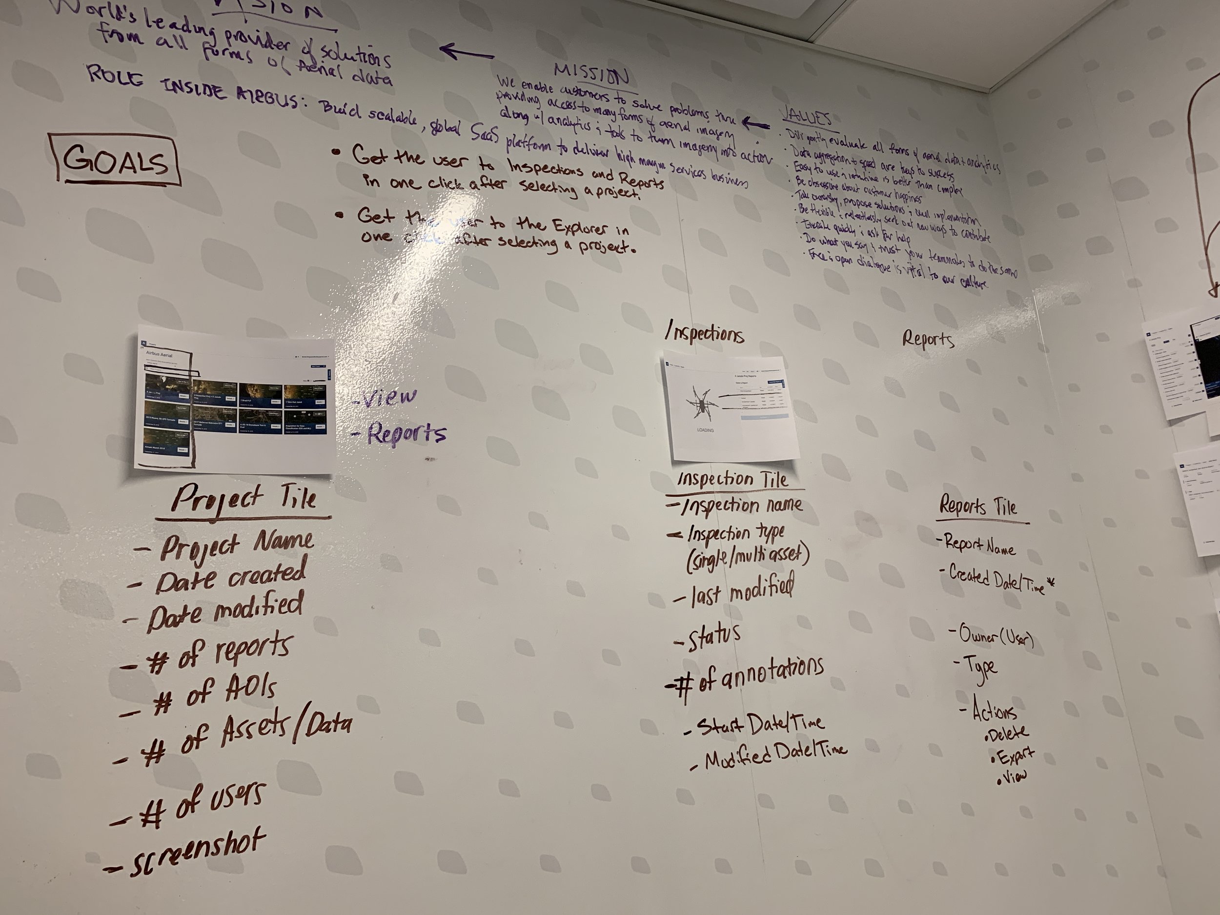
How might we design a solution to improve the speed and usability of the platform for the CAT response use case?
This was a very open ended "improve the ux" exercise, but it gave us the freedom to perform a comprehensive audit of the existing platform and expose potential directions for future enhancements.
GUARDRAILS
Do not redefine features or change core functionality. This was not about changing what the product is. It was about addressing the perceived complexity in a way that didn’t require a huge lift for the dev team.
Aerial Data Portal (ADP)
The Aerial Data Portal (ADP) is a SaaS solution designed to enable our customers to acquire, manage, and analyze aerial imagery from drone, satellite, or manned aircraft. When paired with our user’s assets (policies/properties they insure), the ADP is a comprehensive solution for examining structure status remotely and generating reports to support claims decisions.
Pain Points
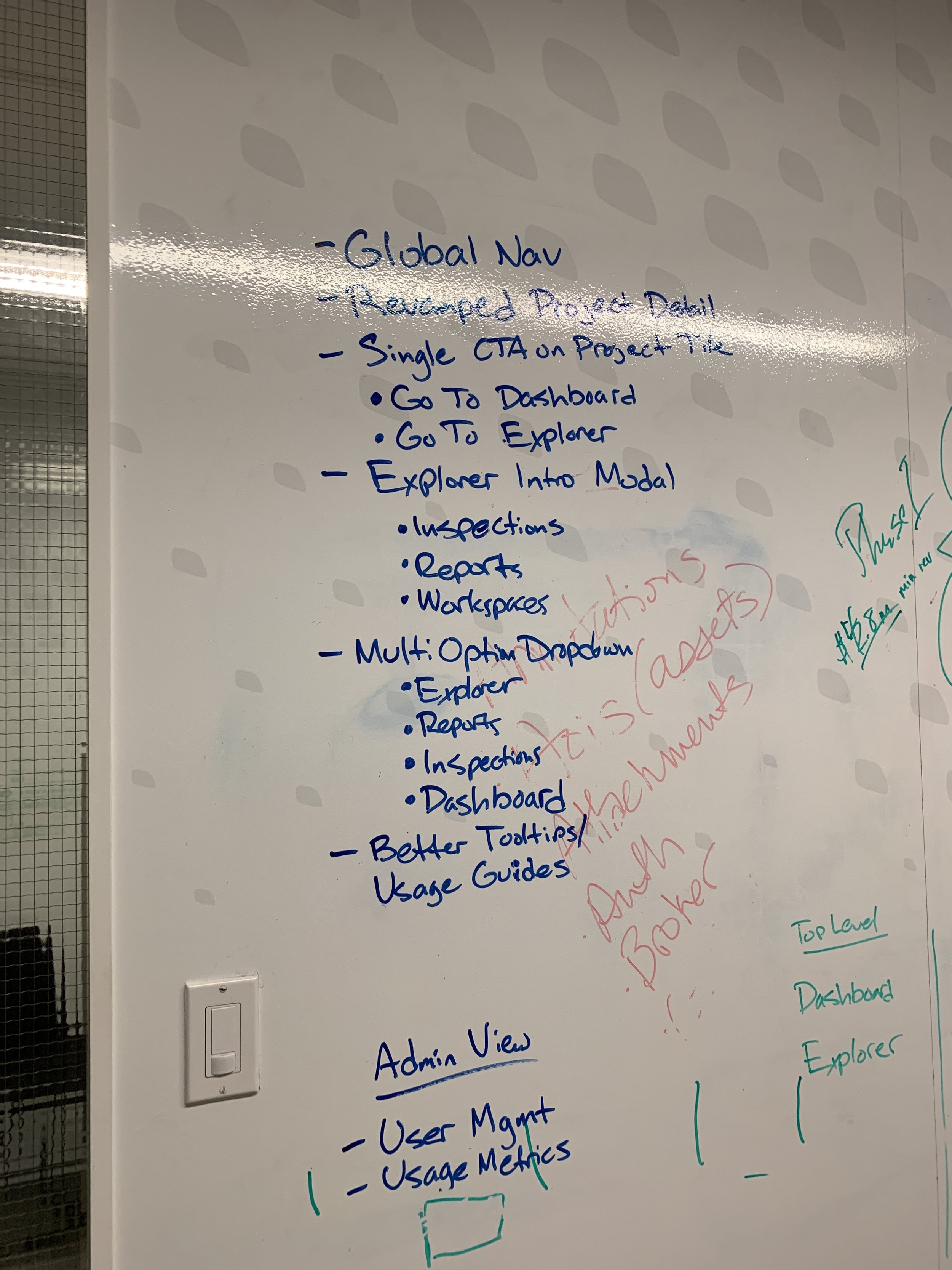
A fundamental requirement of good UX is a deep understanding of your users and the use cases to design an efficient solution around that. With more complex software it’s important to be more intentional about how to guide users through the various workflows. Speaking with our customers exposed some key pain points that did not align with this, so we designed a solution to address the following:
Buried Functionality
Getting to reports required the user to navigate through inspections
Way finding
Breadcrumb navigation was unclear and misleading. It made it difficult for the user to understand where they were or where they would end up
Communication
Lack of tips, help guides, explainers, status indicators, etc. left the user confused about how to proceed
Heuristic Evaluation
Reports are a key value add, so the number of reports created correlates with the amount of value our customers are getting out of the platform. Therefore, our goal is to get our users creating and exporting reports as quickly as possibly. The current version of the ADP was not optimized for this and forced our users to navigate through several sections of the portal before reaching their desired destination.
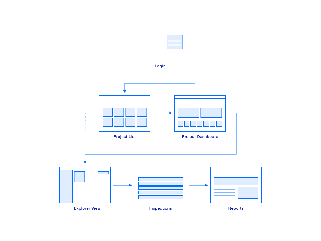
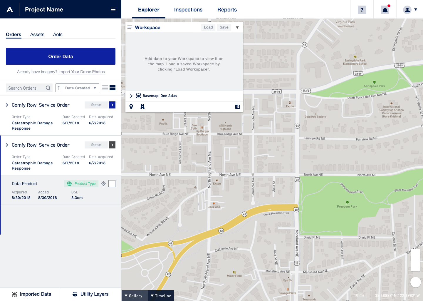
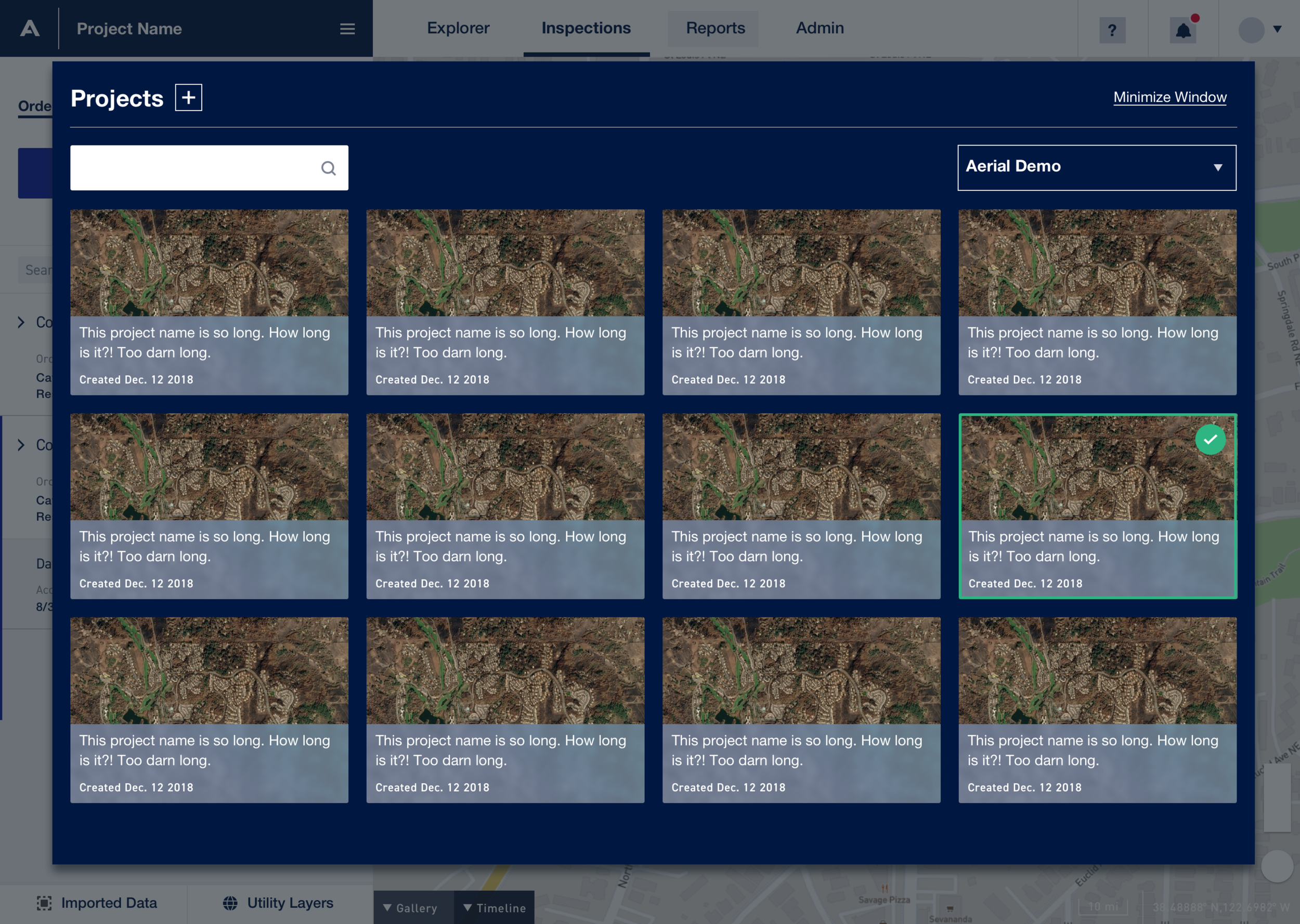
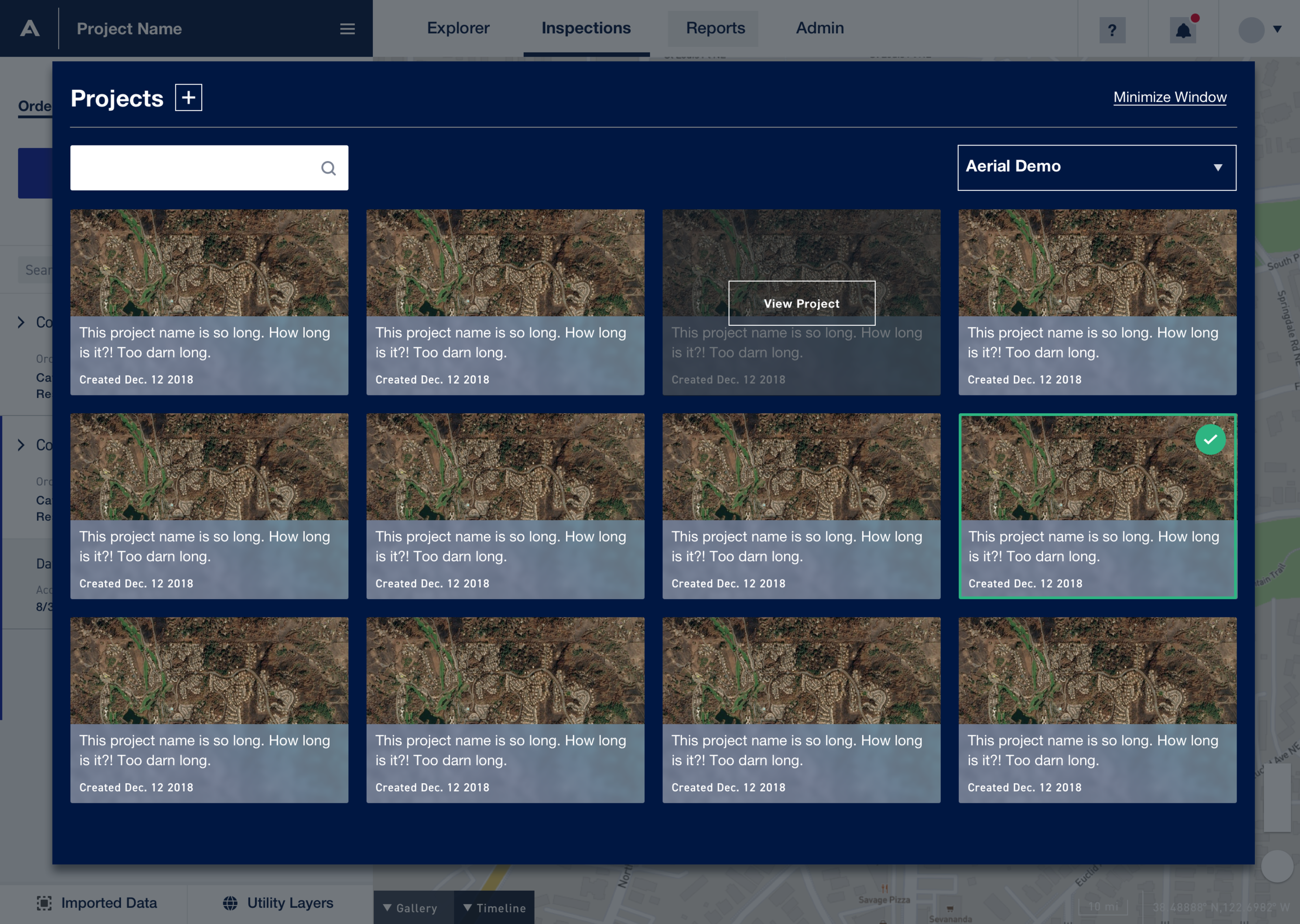
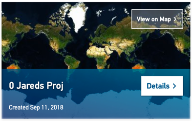
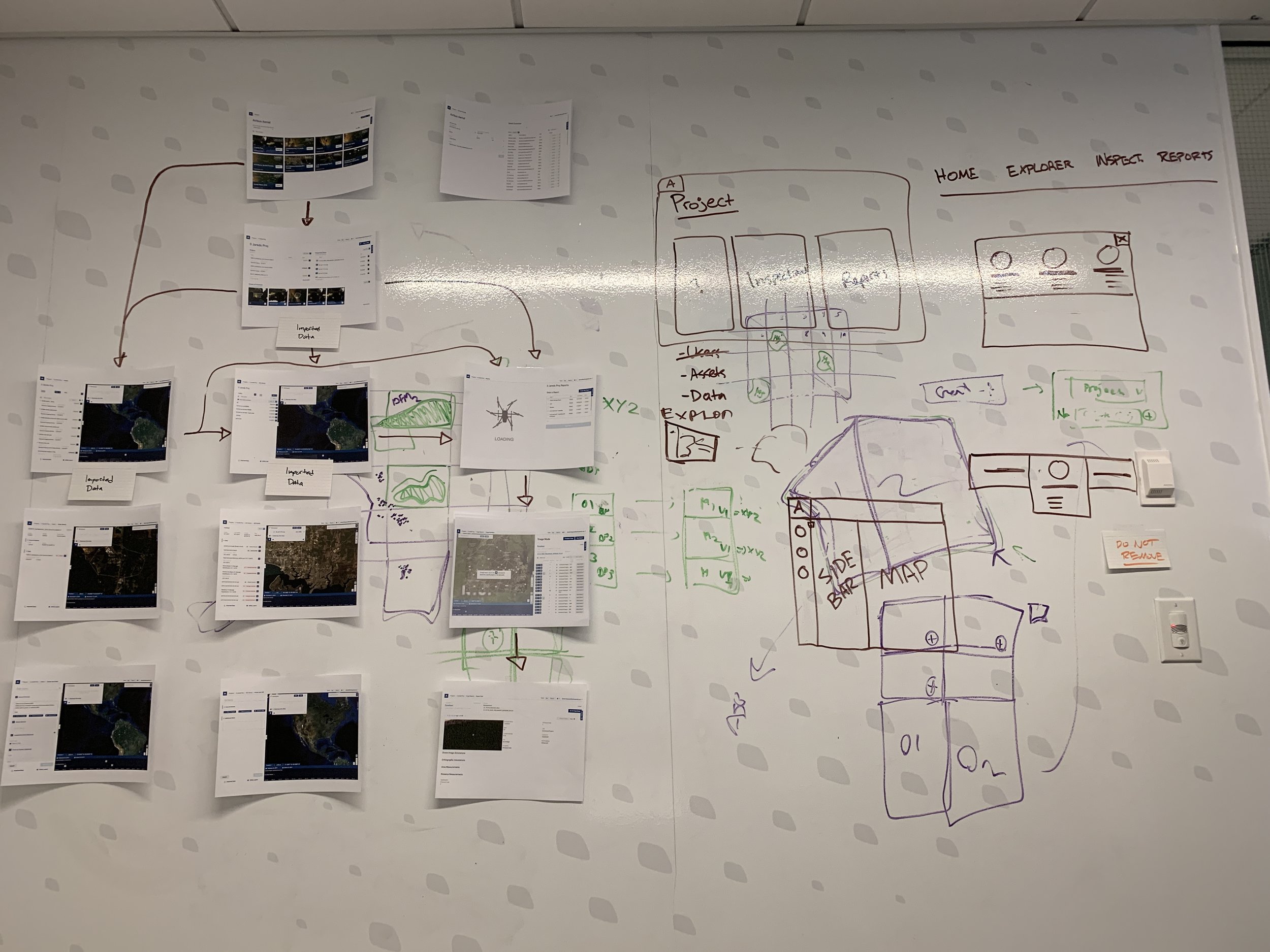
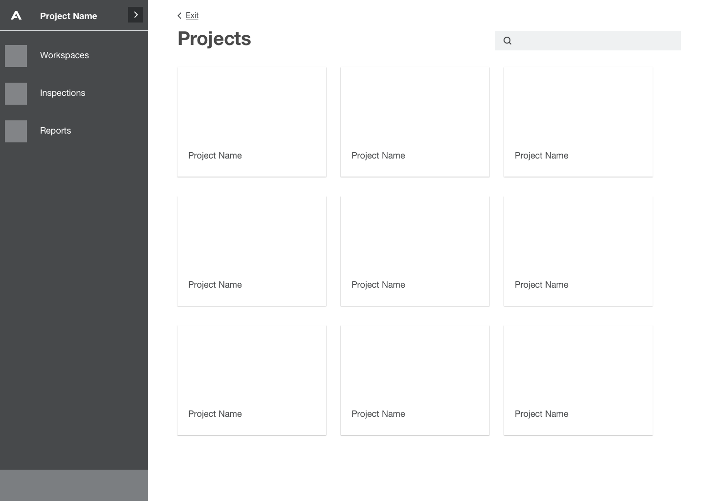
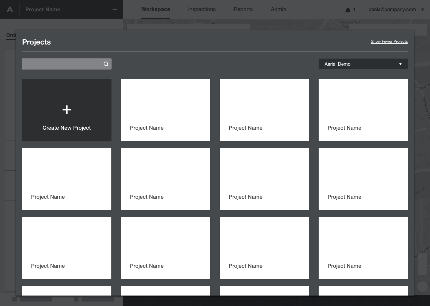
For a user to get to the Explorer they first had to select a Project. Each project contains a variety of user content including Workspaces, Assets, Aerial Imagery, Data Products, Inspections, Reports and more.
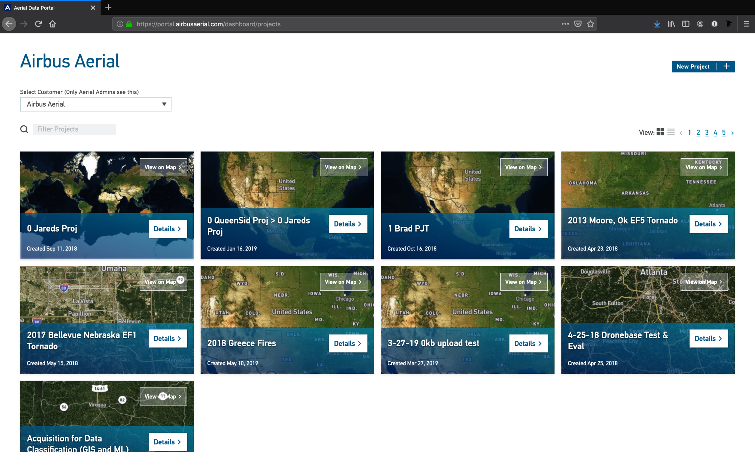
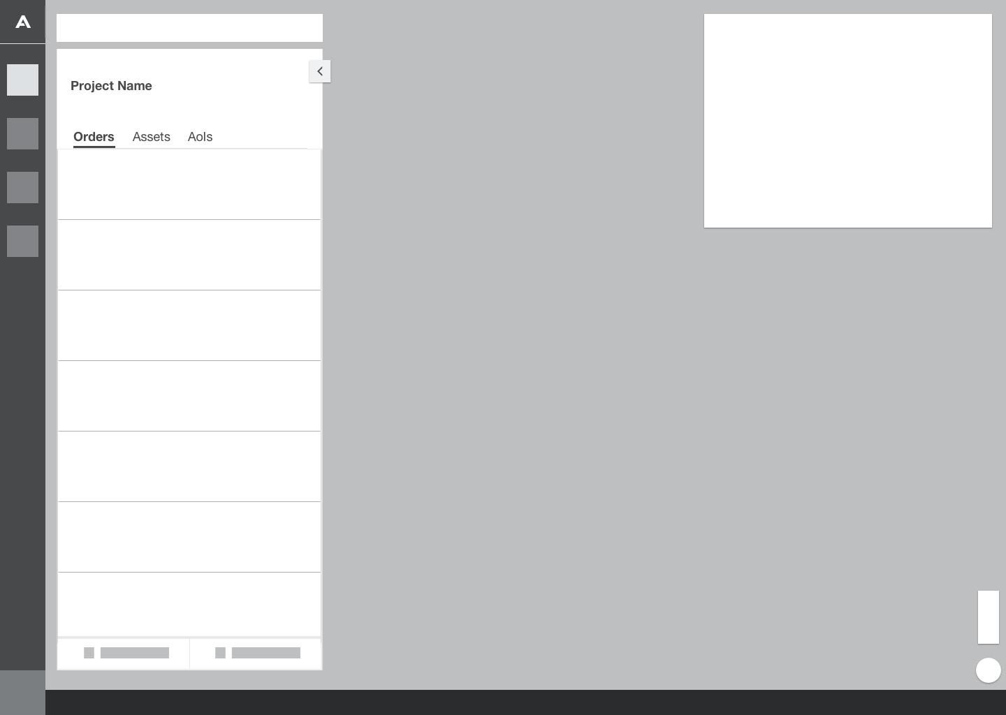
Projects were presented in a tile format by default and each tile had two CTAs – View on Map and Details. If the user were to select 'View on Map' they would be taken to the Explorer view. If they were to select 'Details' they would be taken to the project Dashboard view.
We also learned that our users wanted to navigate to Explorer mode first. The Dashboard view offered little value but by making the 'Details' the primary CTA on the project tile our users often went down that path to get into the project.
Challenge
One of the challenges of this view is the lack of insight into the contents of the project. This can add additional steps for our user if they have to click into a project to see if it does or doesn't doesn't contain what they were looking for.
The tile not only created a decision point, but the styling encouraged users to select the longer path.
Opportunity
Find a way to expose the contents of the Project to prevent the user from playing the Project guessing game.
Remove a decision point and reroute our users down the most desired path.
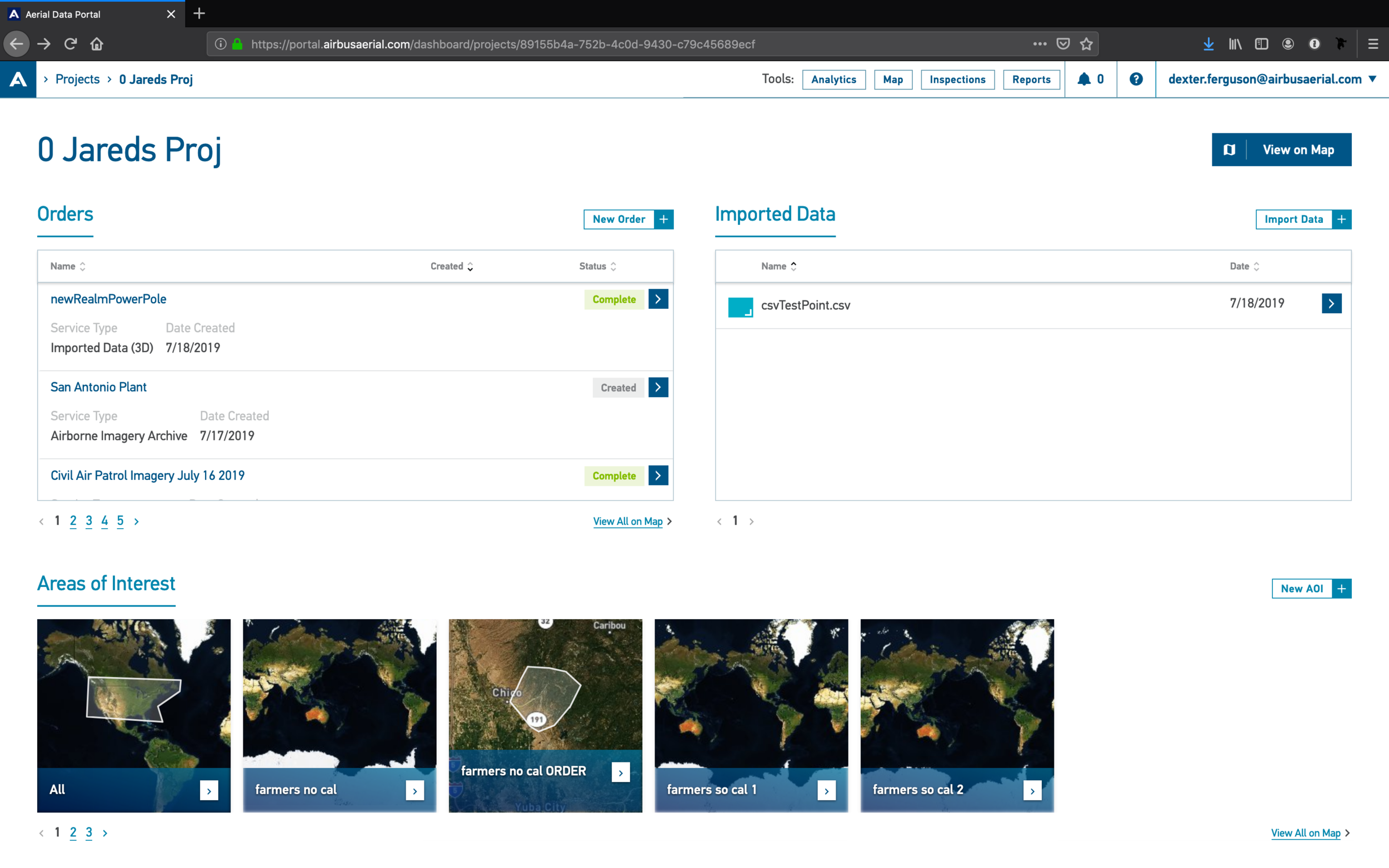
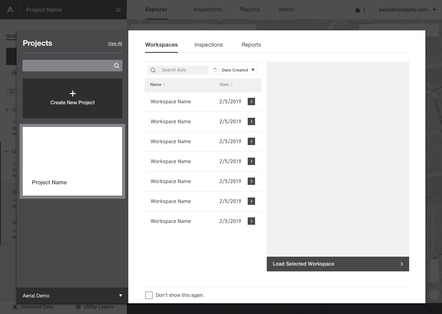
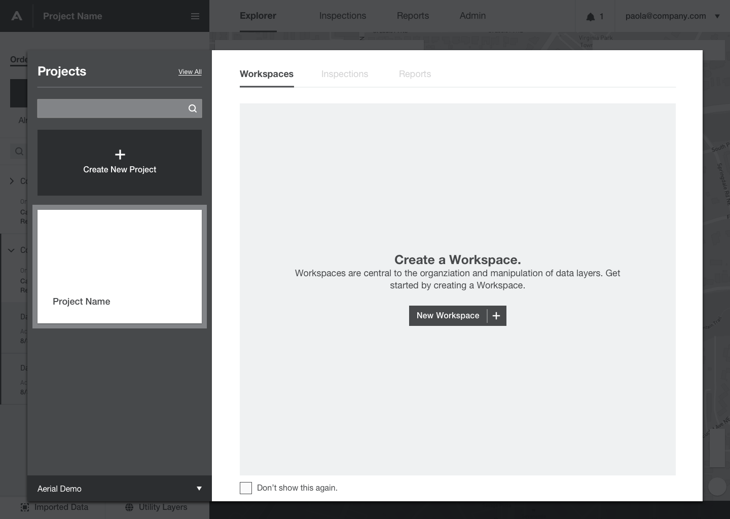
Once the user landed in the project Dashboard they were presented with a display of their Orders, Imported Data, and Areas of Interest (AOI). The Dashboard was intended to be the birds eye view of the project.
Challenge
Each of these groups, with the exception of Imported Data, required the user be within the context of the map. So they couldn't glean any additional insight without first navigating to the Explorer first.
We also found that breadcrumbs and the 'Tools' buttons were unusual as a navigation device.
Opportunity
Remove the additional step of pushing users to the Dashboard which offered little value on its own. Unless we redesigned it to make it more useful it could be removed with little to no impact to the user experience.
Design a better way to navigate the platform that's more intuitive than breadcrumbs.
Explorations
Solutions
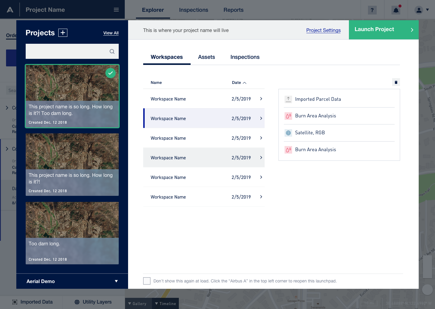
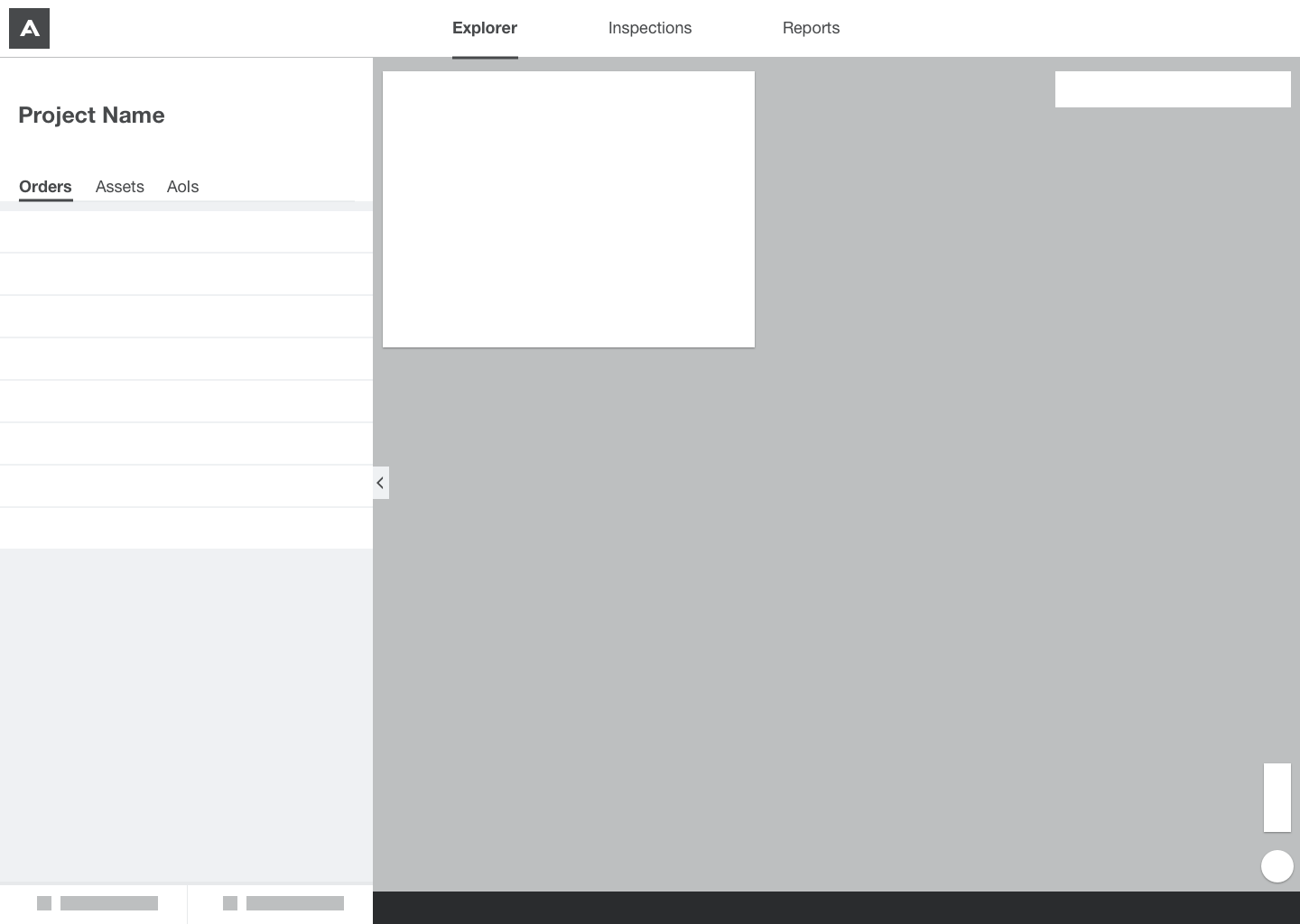
We looked at the user flow and explored some solutions to move the Explorer View closer to the top of the flow. Working with the dev team we were able to save the users' state and return them back to the project they were previously working in after login. This made sense for our users as they often worked in the same project for weeks at a time during a CAT event.
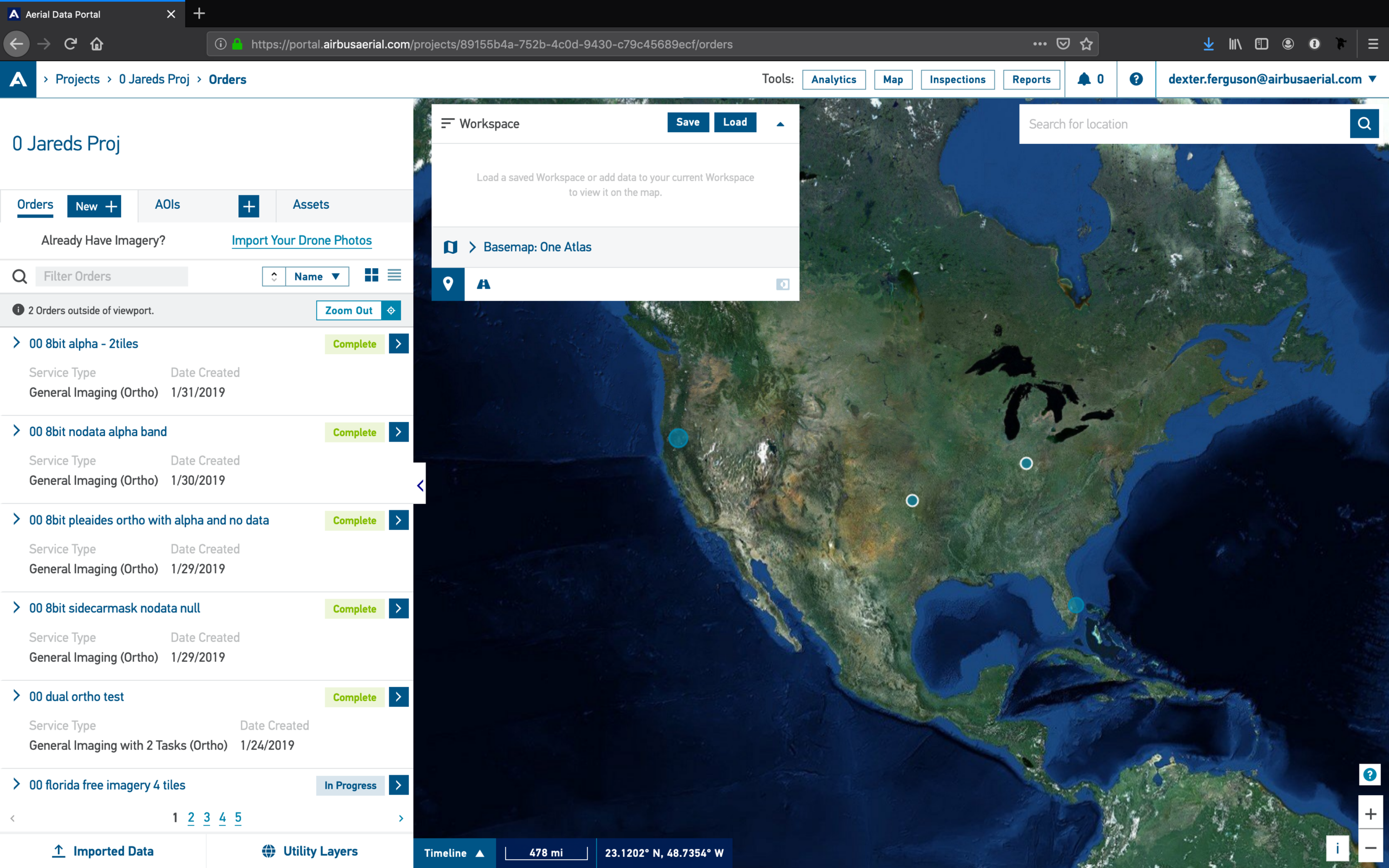
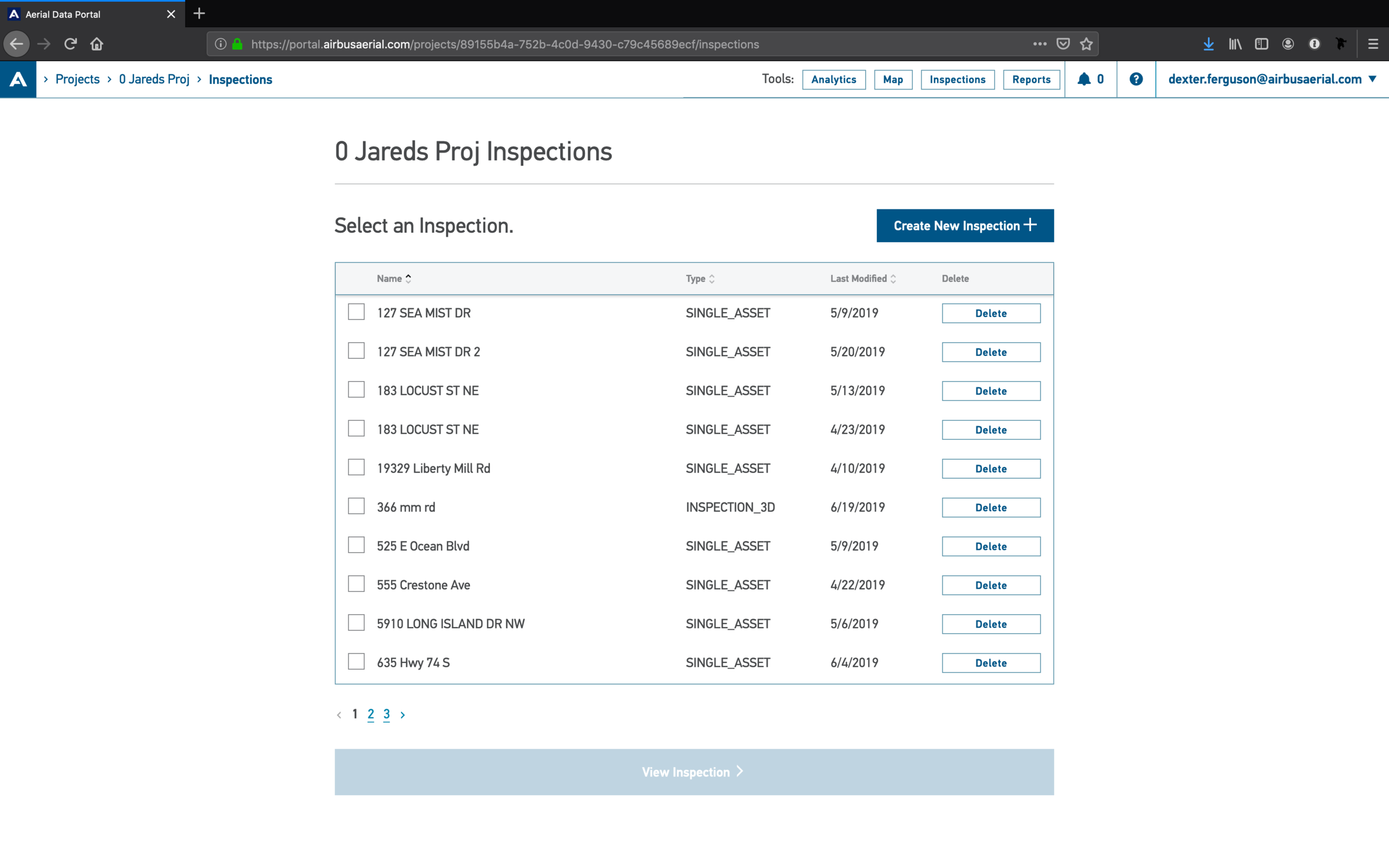
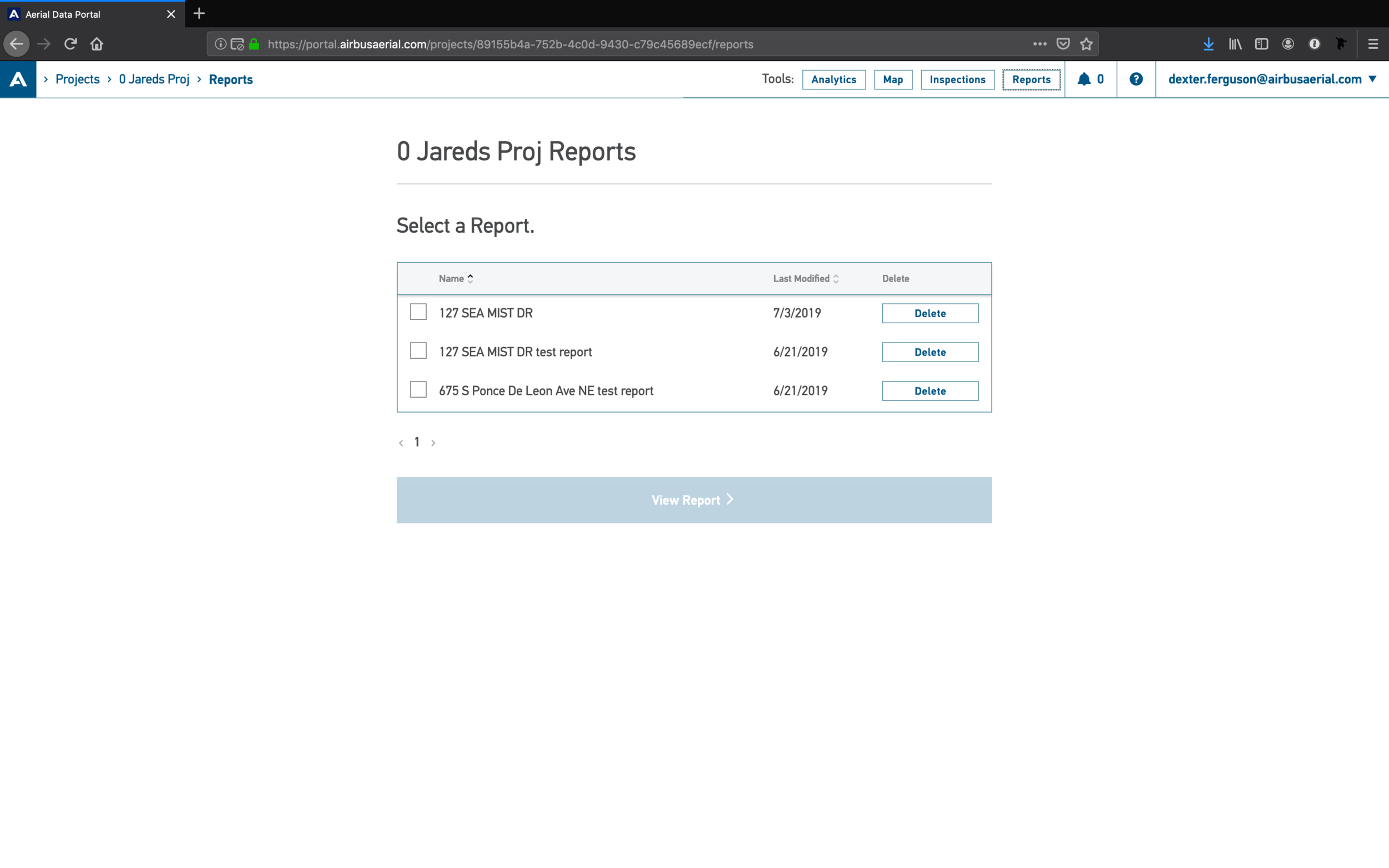
We added a proper global nav bar to show the user their current location in the workflow and allow them to quickly jump to other key sections – Inspections or Reports.
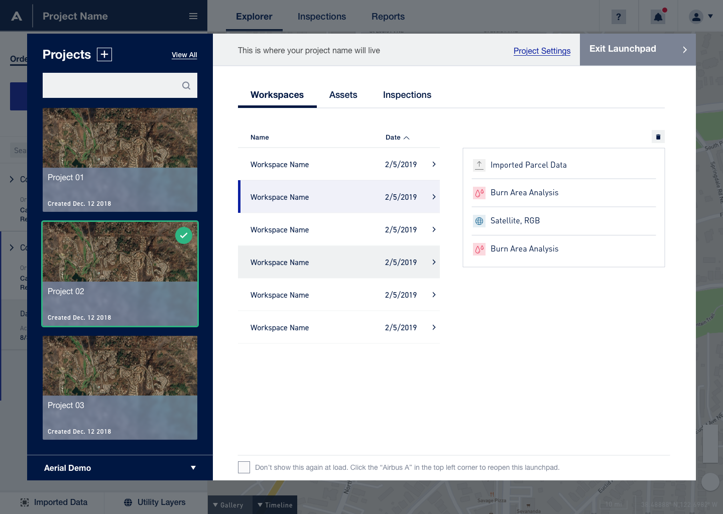
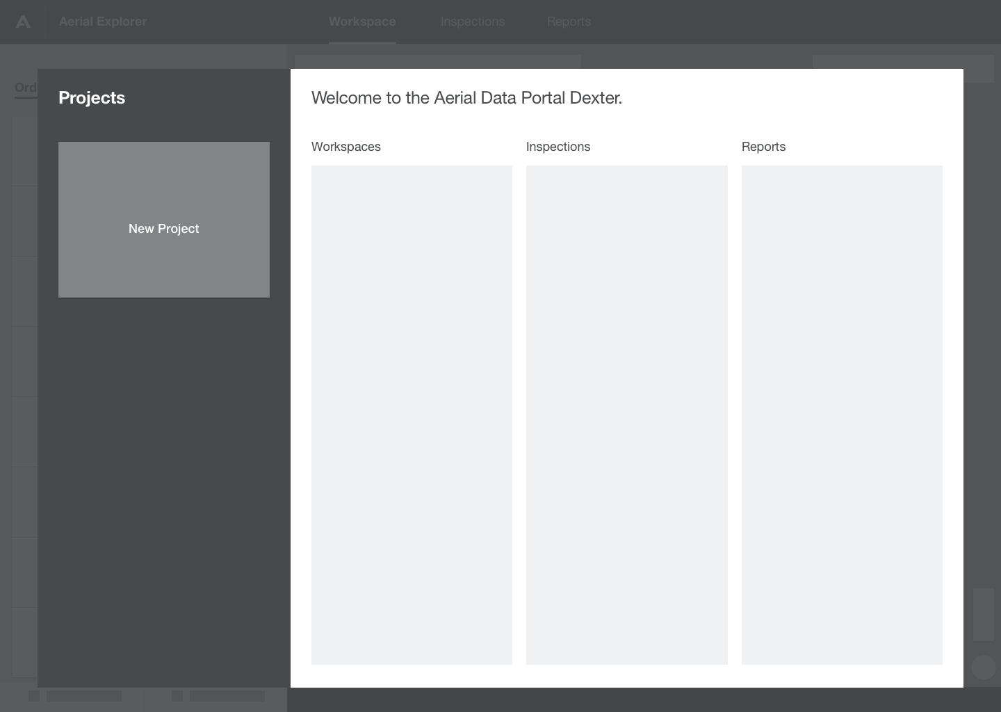
We removed the Dashboard view and replaced it with a Launchpad. The Launchpad is a modal that combines the functionality of the Project List and Dashboard, allowing the user quick access to their other projects and provides additional insight into what they contain.

Final Result